
At the end of last year, I cleared all the old posts from this site and re-launched jonbeebe.net with the intention of focusing solely on programming tutorials and web development. I made a few (in-depth) posts, but life caught up and I didn’t have the time or energy to continue posting those kinds of entries with the regularity and quality I wanted, so I have decided to adjust the focus of this website.
From the back cover (the “about” page, also rewritten):
The goal of this website is to serve as a representation (over time) of my knowledge, digital experiences, work, and interests. It also functions as a kind of public wiki for things I want to save for later, and to be an educational resource for others.
Like strokes of a paintbrush, each post and link published here is just one piece of a larger whole that contributes to a more complete picture of my digital self (but more of a perpetual draft than a masterpiece).
In other words, I want to make this a more personal space by not limiting my writing to just long-winded technical tutorials. These will still be an important part of the site (and will eventually have their own section for easier access), but this change in focus will give me some space to breathe in between long-form posts so I can maintain the quality of said posts while keeping the website’s heart beating with regular (and more diverse) small updates.
To reflect this more personal change in focus, I created a new design that I’m really happy with (shown below, in case the design changes again in the future).
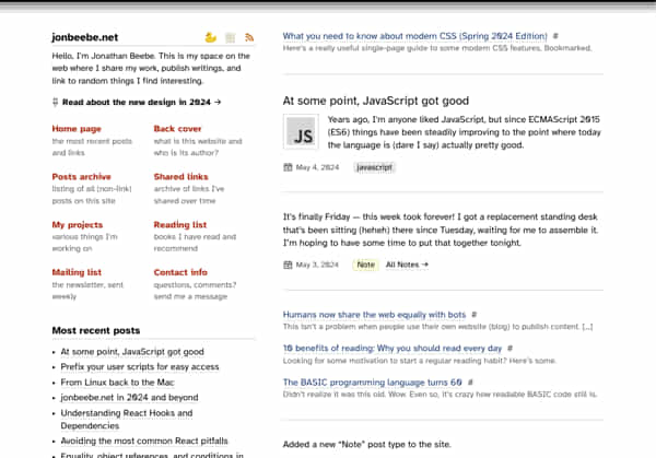
One of my favorite blog designs of all time is kottke.org in 2004, so this site’s new design is a homage to that (and the era it existed in). It may appear outdated to many, but I’m nostalgic for what the web was like in the early 2000s before the social media giants took over. So in my tiny corner of the internet, this is my attempt at bringing it back.
Regarding fonts, it took me a while to find one. Most of the premium fonts I liked require an (expensive) annual license, so I looked for some free options and discovered Atkinson Hyperlegible. It’s from the Braille Institute and was (unsurprisingly) designed for readability. At least to my eyes, at smaller sizes it gives off a bit of an old-school vibe that pairs well with the new design and I really like the way it looks.
Here’s some highlights on what else is new:
- Separate archives for posts and links.
- I started a mailing list to keep readers up-to-date on what’s new (weekly).
- Added a reading list page to share the books that I’ve read and recommend to others.
- The last
10 recent (non-link)5 most recent posts, links, and a listing of all the tags in the sidebar. - A rubber duck that sits at the top.
I have a few other things planned in the future that I’m excited to roll out over the coming months. I hope you enjoy the changes and come back as more content is posted here. Any feedback is welcome!
If you’re new here, please take a moment to join the mailing list!